


About Brooklyn
Brooklyn is the best typeface in many sizes can be used in headline or paragraphs it has a smooth curve in small letters
an example is your front I has created this layout only with Brooklyn typeface.


Logo Explanation
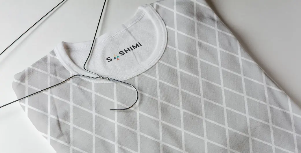
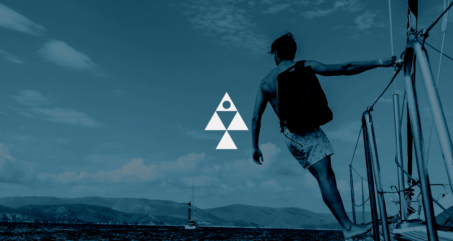
Used, basic geometric shapes and converted to strong logo identity symbol. This symbol is presenting fish and latter A.
That's why I used a symbol in side latter's. to converted logo type symbol also. Color is very complicated issue in this logo I used 4 different colors each color has different value and all colors are presenting brand massage clearly and working very well in black and white background. The mark it self should convey a Power, Stability, Upward, Harmony, Unity, Eternity, Timelessness, and Playful felling also. The mark and the type with the color scheme itself show the clients industry perfectly.
Before designing this logo, I kept everything in mind about how this logo will work today and in the future (10 years from now). I created a logotype with a strong symbol for a reason. SASHIMI is a new brand that people may not know about yet. A brand needs to remind them of its service and quality, so they can use just the symbol in the future. When SASHIMI users know about SASHIMI, they will recognize it with the symbol. Initially, they may need to use the type with the symbol, but over time, people will come to associate the symbol with SASHIMI's services. This will help SASHIMI become a famous brand like Nike and Adidas.